|
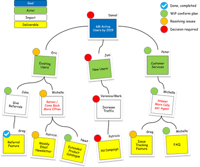
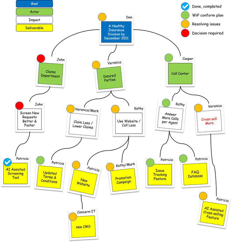
By: Dennis van der Spoel Our products and initiatives do not work in a vacuum. They have an interdependent, dynamic relationship with people, other projects, the organization and the wider community around them. Yet most planning methods either expect the world to stand still while we deliver (Waterfall) or that we give up on creating any kind of long-term big-picture view (Agile), leaving a huge communication gap between business sponsors and delivery teams. Impact maps visualize the dynamic relationship between delivery plans and the world around them, capturing the most important assumptions as well as delivery scope. They help us adapt plans effectively and react to change, while still providing a good road map for delivery teams and a big-picture view for business sponsors. The Issues with Portfolio ManagementWhether you are using a silo or a value stream approach to portfolio management, strategic alignment remains a major challenge. In the silo-oriented project portfolio management-approach, this is often due to segmentation of budgets and accountabilities. In lean-agile product/project portfolio management this is due to the focus on the short-term value of initiatives. In both cases, impact mapping offers a solution. In silo-based portfolio management, impact mapping helps to align and prioritize all initiatives across the silos. In lean-agile portfolio management, impact mapping helps to discover and communicate the longer-term business value of potential epics. If you would like to learn more about the issues with portfolio management, you might be interested in benefit mapping as well. About Impact MappingImpact mapping is a strategic planning technique made popular by Gojko Adzic. It prevents organizations from getting lost while building products and delivering projects, by clearly communicating assumptions, helping teams align their activities with overall business objectives and make better roadmap decisions. Impact mapping helps to reduce waste by preventing scope creep and over-engineered solutions. It provides focus for delivery by putting deliverables in the context of impacts they are supposed to achieve. It enhances collaboration by creating a big-picture view that business sponsors and delivery teams can use for better prioritization and as a reference for more meaningful progress monitoring and reporting. Finally, it helps to ensure that the right business outcomes are achieved, or that unrealistic projects are stopped before they cost too much, by clearly communicating underlying assumptions and allowing teams to test them. Impact mapping can help you to deliver projects that make an impact, not just ship product. Here is an example of how an impact map could look like: An impact map thus is input for the portfolio backlog, the (outline/lean) business case(s) for initiatives, and for the story map(s) or work/product breakdown structure(s) of initiatives. It’s also the basis for your benefit realization plan and organizational change plan and should therefore include the names of people accountable for each item. There should also be a clear line of sight between a product/solution roadmap, the value stream map, the release/increment/tranche plan, and the relevant impact map. Impact maps can be cascaded; impacts on high-level maps can be used as a goal on lower-level maps. Depending on the type and scope of the impact map and frameworks used, a deliverable may represent the following work items:
The following reference table of work items may prove useful. However, sizes of work items may vary wildly from context to context. This table is just an example based on my own personal experience:
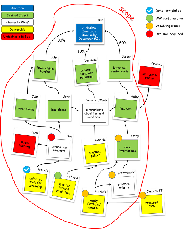
Visualizing causalityI have used many different causality diagrams over the years. However, the most useful diagrams for driving change I have found to be Benefit Maps and Impact Maps. Both techniques can be kept simple, focus on impact to be made, create strategic alignment, foster cooperation, and help discover deliverables and changes to the way of working to put on the backlog. Impact maps differ from benefit maps in the sense that impact maps are stakeholder oriented (outside-in, benefits for our stakeholders) while benefit maps are centered around our own ambitions (inside-out, benefits for us). Where a benefit map focuses on changes to our own way of working and the enablers required, the impact map focuses primarily on discovering key functional requirements to impact the stakeholder’s way of working. Further, a benefit map also helps to visualize causality and dependencies between branches while an impact map is a more hierarchical model. That’s why they produce different results, even when using the same starting point: Therefore, a benefit map is best used to improve our organization and optimize our value streams or programs. An impact map is best used to quickly improve value propositions (products and services). Both instruments are vital in defining and refining your portfolio(s). At Dennis van der Spoel Consulting we have used both techniques when working with our clients regardless of frameworks used (e.g. Scrum, PRINCE2, AgilePM, MSP, AgilePgM, MoP, AgilePfM, SAFe, LeSS, Nexus, PMBOK, etc.) Always keep in mind that, as an exercise, the map itself is not the goal; the objective is to attain alignment, cooperation, and flow and ultimately to ‘move the needle’ for ourselves and our stakeholders. How to create an Impact MapAt Dennis van der Spoel Consulting we use workshop facilitation to create Impact Maps. We will play multiple steps. Each step represents a layer in the impact map:
Most steps consist of multiple rounds (timeboxes):
Like all things worthwhile, the impact map is created in an incremental and iterative process. Don’t go in with a first-time-right-attitude. You will always need multiple sessions to create your first map as insights will change. That is the true value of the impact map; not the map itself, but the discussions and learnings the team will have while creating it. The best collective decisions are the product of disagreement and contest, not consensus and compromise. - Surowiecki So, although the timeboxes seem very short, they provide plenty of time if you suppress the urge to get it right the first time and inclination to settle all debates in the first session. The first pass should be quick and dirty. Park questions and disagreements on a flipchart to be settled later in consecutive workshops or in separate meetings. When creating your first impact map you typically need 3 iterations / sessions spread over a 2 to 5-day period to get a robust version. However, you should have a complete map after the first session. Later sessions are used for refinement, processing feedback and backbriefing the leading indicators and norms the owners have set for their items. There also is no completed state of the impact map, as circumstances will change over time. That’s why the impact map should be updated at the end of each program increment (SAFe), tranche (MSP) or project stage (PRINCE2). Need Help?We provide this instruction exercise for your convenience and learning. You are welcome to use it freely to your benefit. However, we understand that there can be many reasons why using an external facilitator might smoothen the process. At Dennis van der Spoel Consulting we have extensive experience with facilitating benefit & impact mapping workshops for our clients. We have literally done this dozens of times with fantastic results. Please contact us for a quote.
1 Comment
20/2/2019 01:01:51
Another great Impact Mapping workshop at Agile Holland Meetup.com.
Reply
Your comment will be posted after it is approved.
Leave a Reply. |
Archives
August 2020
Index
All
|
||||||||||||||||||||||||||||||||||||||||||||||||||||||
Services |
Company |
|


 RSS Feed